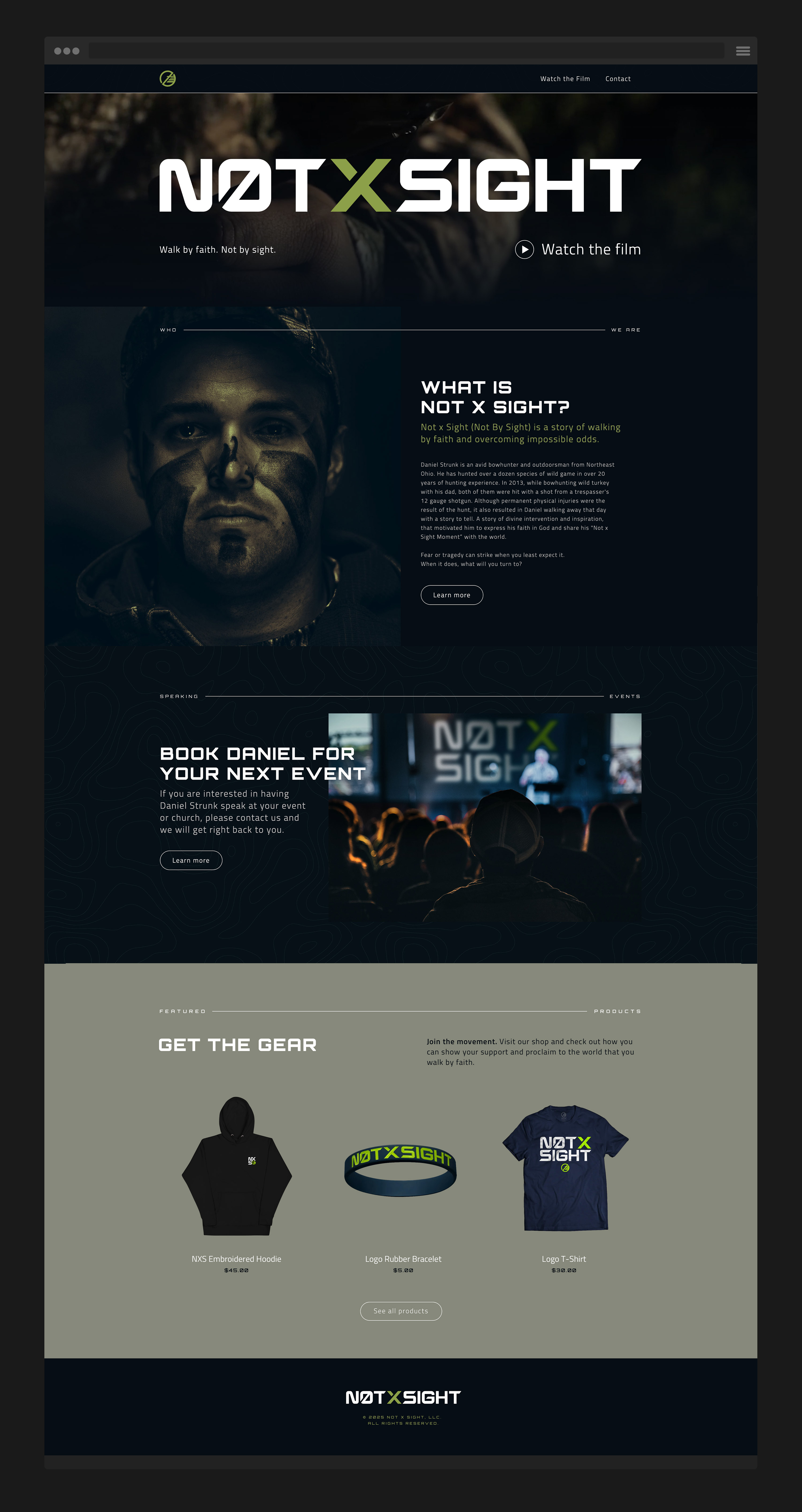
Not x Sight
Inspired by the powerful true story of Daniel Strunk, Not x Sight (Not By Sight) is more than a project, it’s a movement. One built to honor those who choose to walk by faith when the path ahead is uncertain or unclear. I lead the full brand buildout and creative direction across every touchpoint, helping bring this deeply personal vision to life in a way that felt both grounded and transcendent.
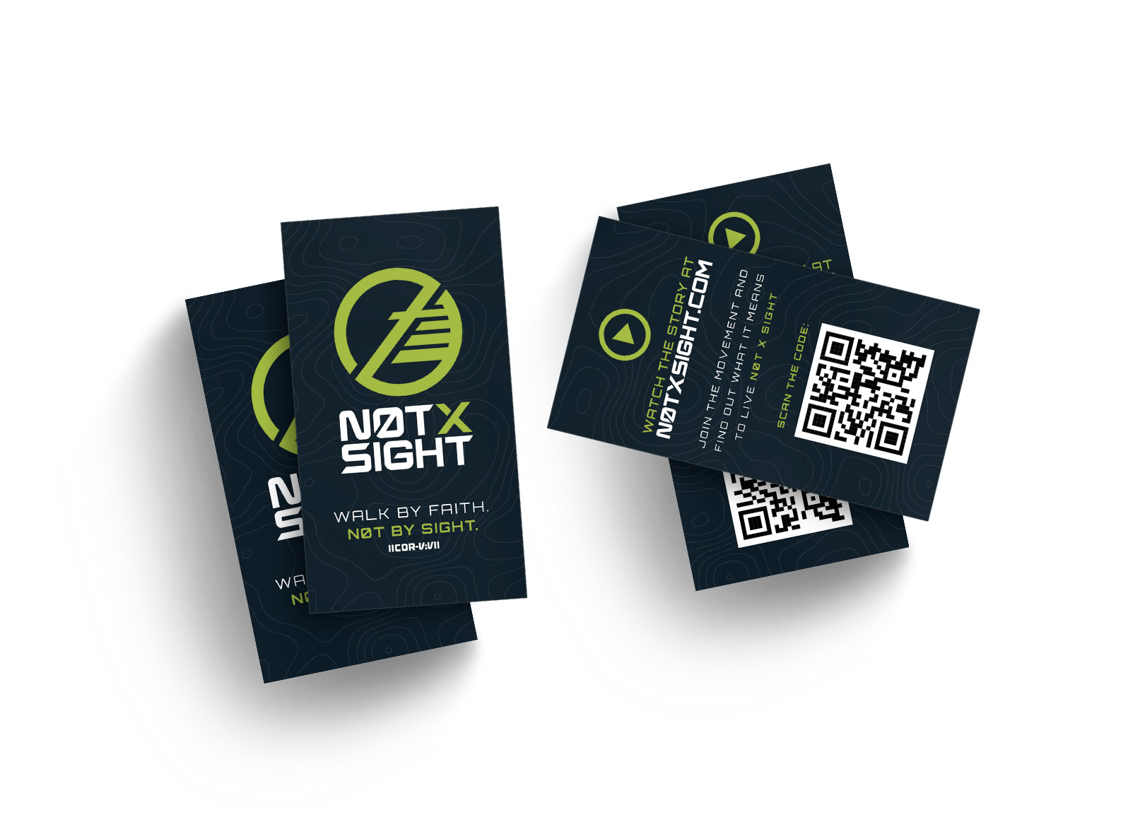
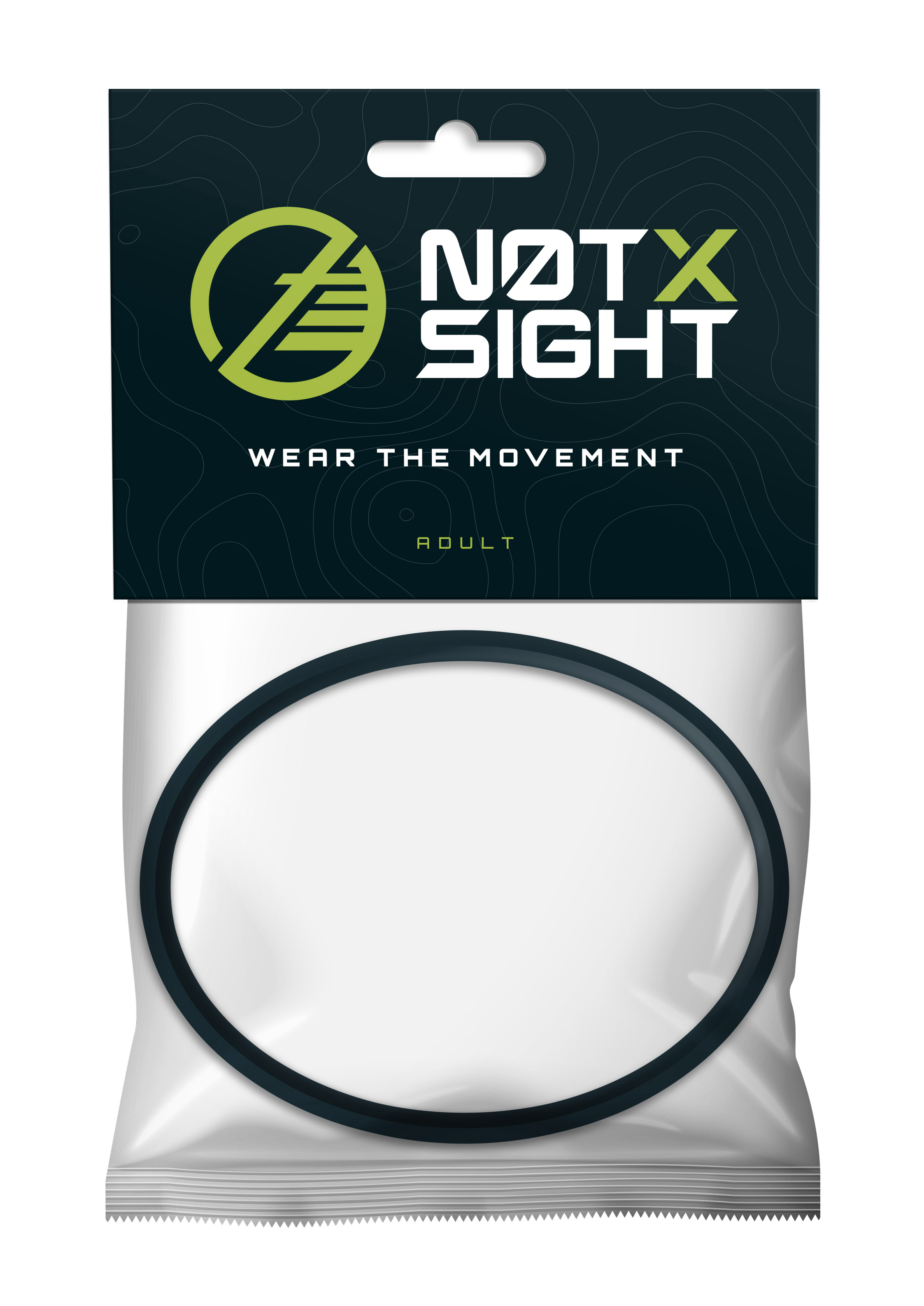
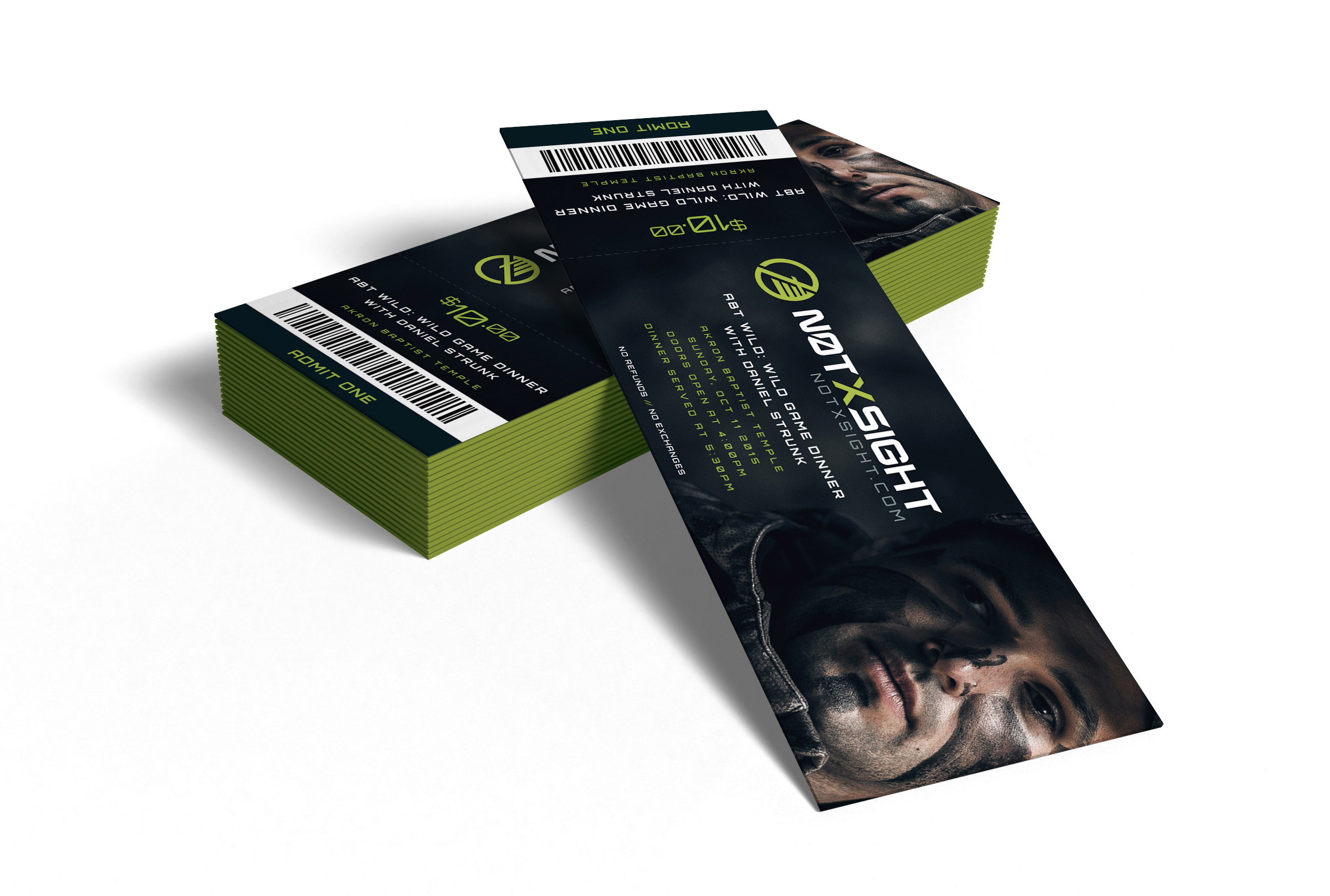
Logos & branding
The Not x Sight wordmark is a custom typeface, designed to reflect the brand’s balance of strength and restraint. Each character features subtle angular cuts and deliberate spacing, echoing the precision of a bow sight and the clarity of unwavering faith.
Iconography & symbolism
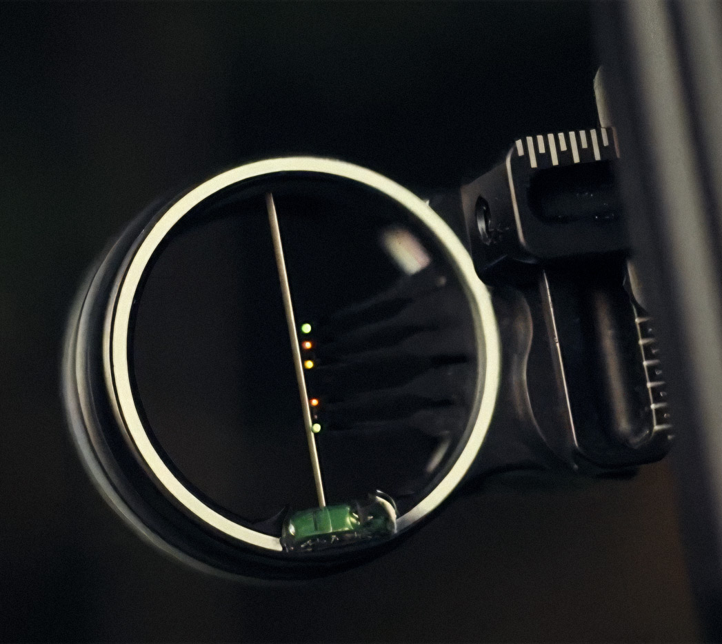
At the heart of the brand is a symbol loaded with meaning, both visual and spiritual. Inspired by the moment of Daniel Strunk’s life-altering experience while bow hunting, the logo is modeled after the sight of a compound bow.
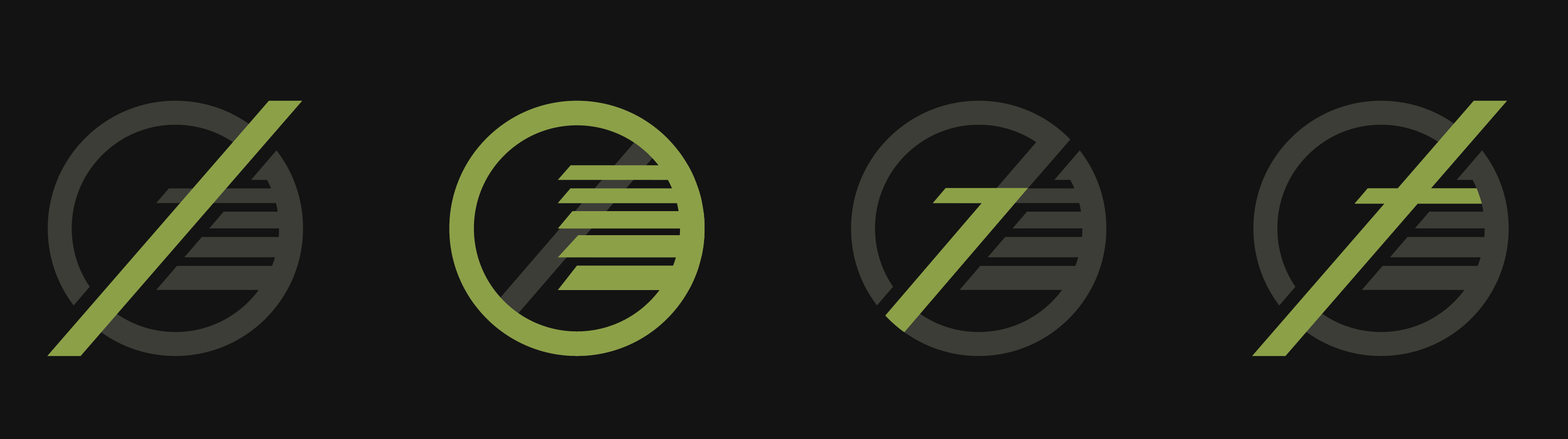 A diagonal slash cuts through the bow sight, symbolizing the word “NOT” and representing the act of crossing out dependence on physical sight. Within the sight are five pins, along with a central “7,” a direct reference to 2 Corinthians 5:7 — “For we walk by faith, not by sight.” Together, they embody the message behind the movement’s name. At the core of the mark, a subtle cross anchors the design, grounding the symbol and the brand itself in faith and purpose.
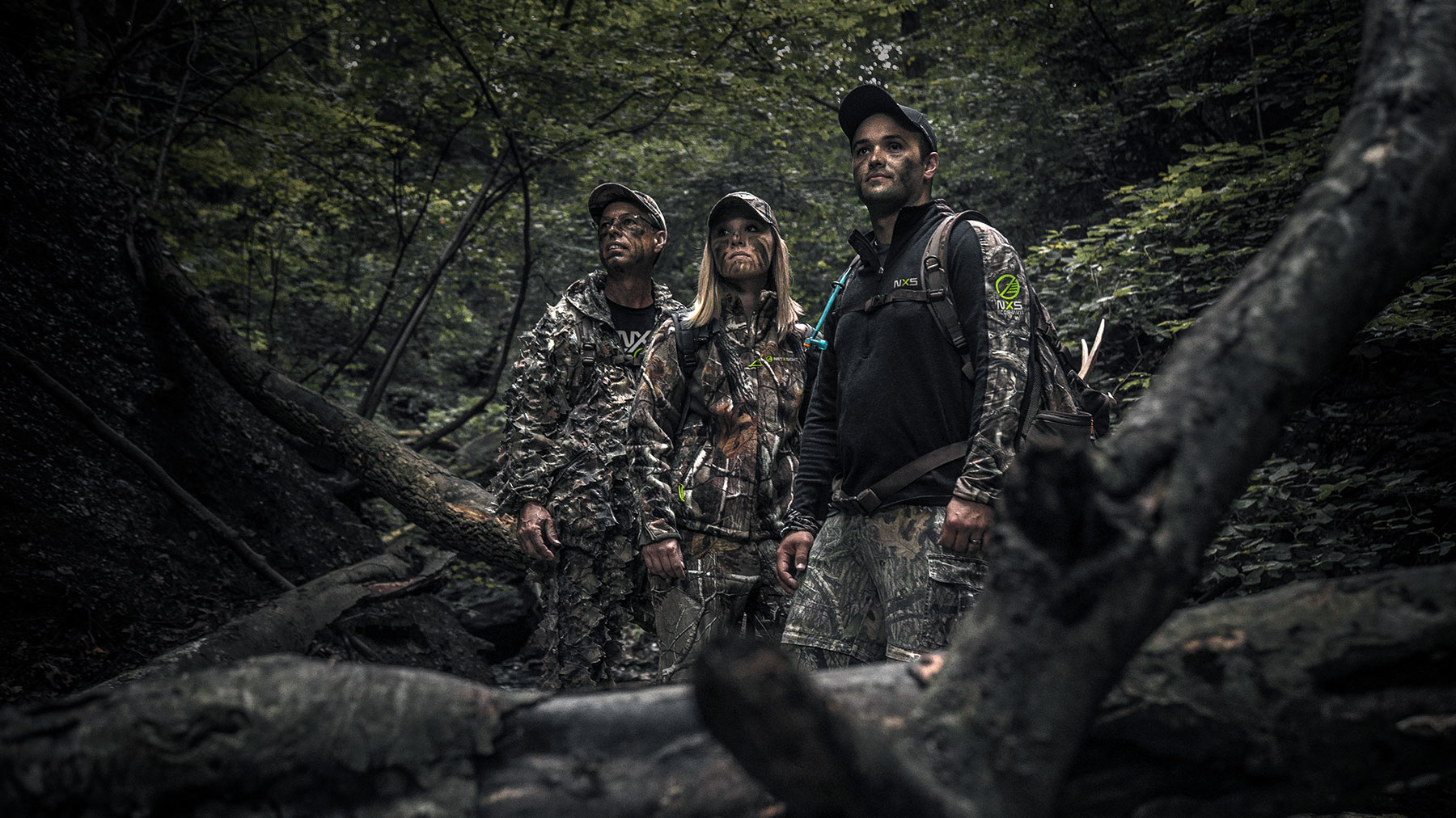
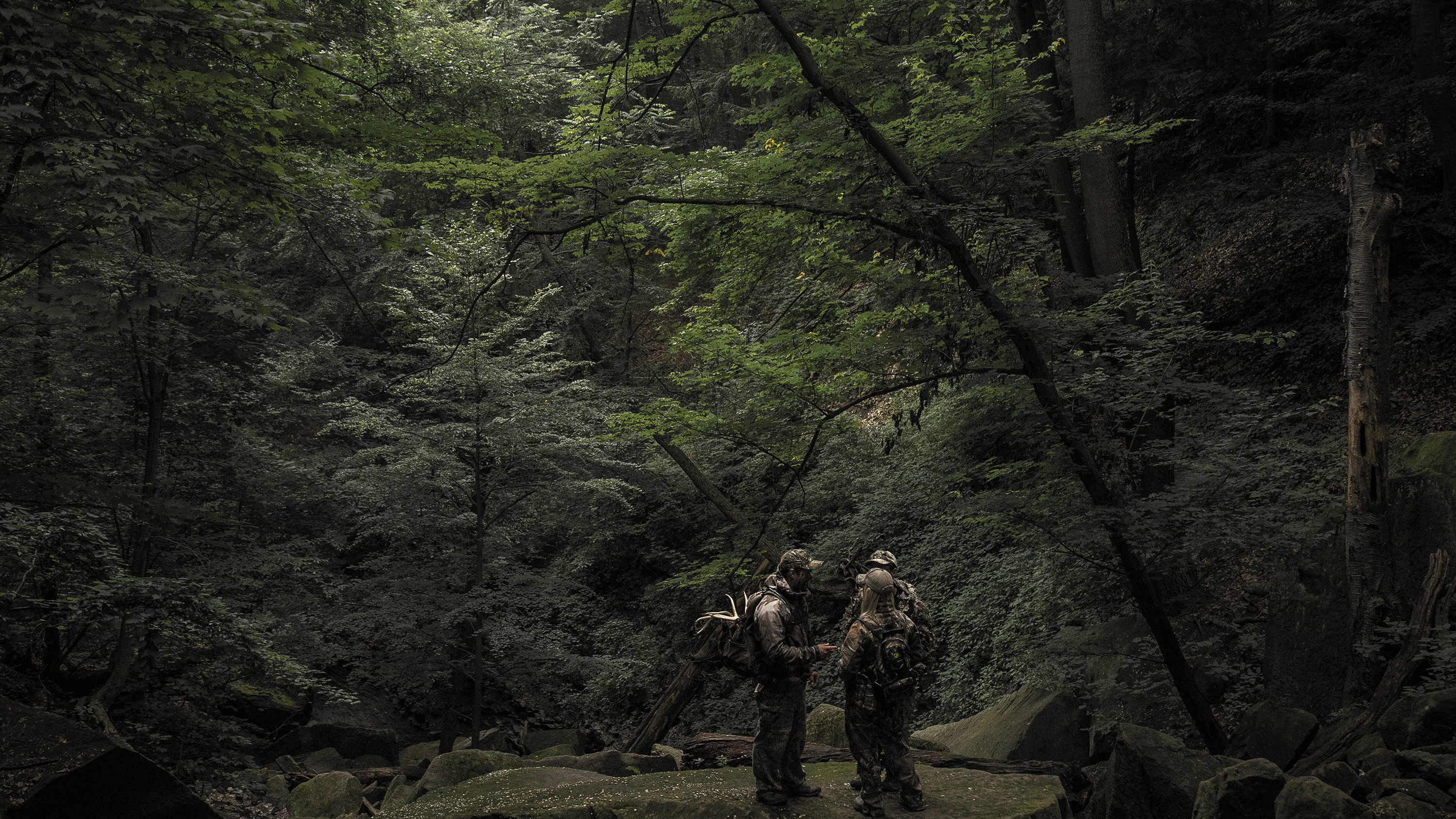
Examples of photography
![]()
![]()
![]()
![]()
![]()


Documentary / short film
I also served as Creative Director for the Not x Sight short film, ensuring the visual tone of the story remained cohesive with the brand. Shot with cinematic minimalism and emotional depth, the film is filled with symbolic imagery, natural textures, and honest light—underscoring the tension between hardship and hope. Wardrobe, locations, and even title cards were all crafted to support the aesthetic and message of the movement.
End credits
Branding & design
Web design